
The Brand Rationale Behind Our 35th Anniversary Logo
Somersfield Celebrates 35 Years!
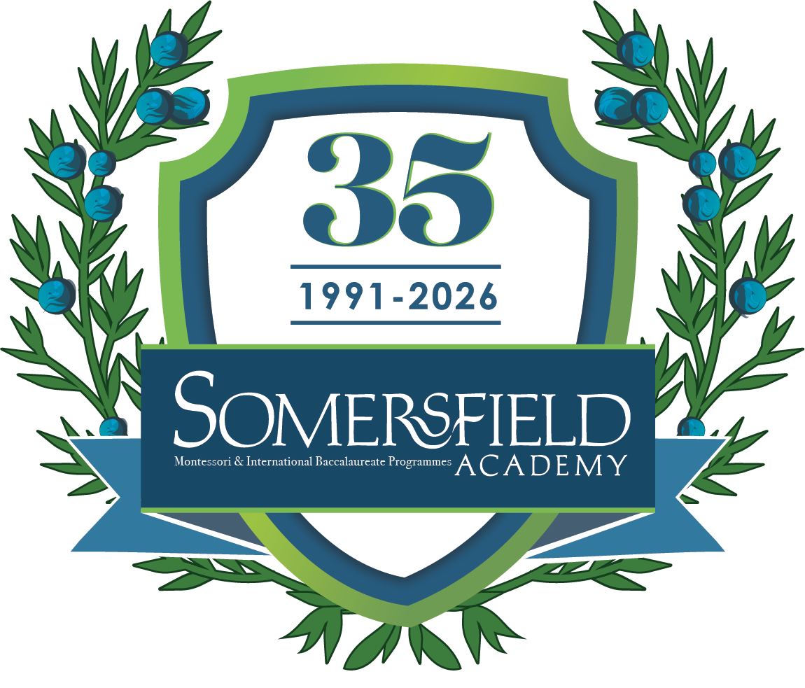
As we celebrate 35 years of Somersfield, our anniversary logo has been thoughtfully designed to honour our history, reflect our values, and acknowledge the journey that has shaped us as a school community. Created by Talisa McGlashan, a Longtail Parent, the logo is both a celebration and a reflection, recognising where we have come from and looking ahead with purpose.
Marking a Meaningful Milestone
At the centre of the design is the number 35, representing more than the passage of time. It symbolises the generations of students, families, educators, and supporters who have contributed to Somersfield’s story. Rooted in both Montessori principles and the International Baccalaureate continuum, our approach to education has always focused on developing the whole child — academically, socially, and emotionally — and this milestone reflects the lasting impact of that philosophy.
Growth, Inquiry, and Continuity
The flowing, contemporary form of the logo reflects growth, movement, and continuity. These ideas closely align with our educational journey, where learning is viewed as a process rather than a destination. From the independence and curiosity fostered in Montessori classrooms to the inquiry-based, globally minded approach of the IB, Somersfield has consistently encouraged students to think deeply, ask questions, and take ownership of their learning.
Over 35 years, we have experienced both highs and lows. Most recently, the challenges faced by independent schools during COVID were felt deeply, particularly for a community-based school like Somersfield, where connection and collaboration are foundational. The logo reflects this resilience — a school that has adapted, remained true to its values, and been strengthened through shared challenge.
The Cedar Wreath: Rooted in Bermuda
Encircling the design is a cedar wreath, a powerful symbol of strength, endurance, and belonging. The Bermuda cedar firmly positions Somersfield within the wider Bermuda community, reflecting our deep local roots and our responsibility to educate students who are grounded in place while prepared to engage with the wider world. This balance mirrors the IB learner profile and Montessori’s emphasis on respect for environment and community.
The wreath also represents unity — a reminder that Somersfield was built, and continues to thrive, through partnership between families, educators, and the broader community.
Colour, Trust, and Possibility
The blue gradient was chosen to convey trust, depth, and stability — qualities essential to a learning environment where students feel safe to explore, take risks, and grow. The transition within the colour reflects progression and possibility, echoing the developmental pathways that guide students from early learning through to internationally recognised IB outcomes.
A Commemorative Identity
This anniversary logo is designed to sit alongside Somersfield’s established identity, rather than replace it. It will appear across communications, events, and celebrations throughout our 35th year as a commemorative symbol — one that honours our history while supporting our future direction.
Looking Ahead
While this logo marks 35 years of Somersfield, it also reflects a school that continues to evolve, guided by strong foundations in Montessori and IB philosophy. Built on community, strengthened through challenge, and rooted in Bermuda, Somersfield remains committed to nurturing confident, compassionate, and internationally minded learners.
We are grateful to Talisa McGlashan for capturing the spirit, resilience, and educational philosophy of Somersfield in this meaningful anniversary design.
35th Anniversary Calendar of Events
February 23 - 27 Montessori Education Week - 35 Years of Montessori
February 27 International Day - Digging into the Archives of Diversity
March 9 Somersfield Giving Day - Celebrating 35 Years of Giving
March 13 Alumni Give Back
March 16 - March 20 Spirit Week - Student Celebrations!
April 23 - 35th Anniversary Golf Tournament for Bursaries
June 9 - Donor and Volunteer Appreciation Evening
December 2026 - 35th Anniversary Year in Review